BACK HOME
Chinatown is the home of the Chinese in a foreign country. In the past, everyone seemed like family, but with the passage of time and the emergence of a new era, the feeling of home is now fading away. Therefore, I decided to use the objects in Sydney's Chinatown and find the feeling of ‘home’ through design, so that Chinatown is no longer a cold commercial street. “Back Home” is a combination of traditional Chinese architectural features and modern elements. In addition to integrating it into the Chinatown environment, my ultimate goal is to create a sense of home and bring the audience back home.


SITE VIEWS
The objects I chose to design are the telephone booths and trees in Chinatown because they are also more or less related to ‘home’. The phone booths were chosen because in a time when cell phones were not popular, the phone could be used to contact family members far away and tell them how much they missed them. The tree was chosen because the open branches and leaves are like a family tree, representing a big family that loves each other.


GRAPHICS ELEMENT
The telephone and embrace are associated with the concept of home, so the main inspiration came from the telephone logo, and the embrace logo in the top view. The hair of the stone lion was also referenced to match and fit the ‘Chinatown’.

There are three versions of a graphic element, one with a solid whole, another with a solid circular form, and finally a hollow circular form. The solid whole is mostly used for three-dimensional objects and the circular form is mostly used for flat surfaces.

WAY FINDING
The signage is located near Dixon St., at the junction of Hay St. and George St.
According to my survey, most people went south after they get off the light rail. A small number of people turned into Hay St. and most of the others went along George St.
Since that is the place they must walk past, putting the sign here will make them notice and attract them finding the design installation by following the trail marker on the Hay St.

SIGNAGE
Instead of a normal rectangle, the appearance of the signage is based on graphic elements and the audience can imagine it is sunk into the ground, and the background is embellished with graphic elements.

TRAIL MARKER
The trail marker was inspired by the upper part of the Chinese word for ‘home’ and combined with my graphic elements. And the ‘丶’ stroke became the pointing arrow.


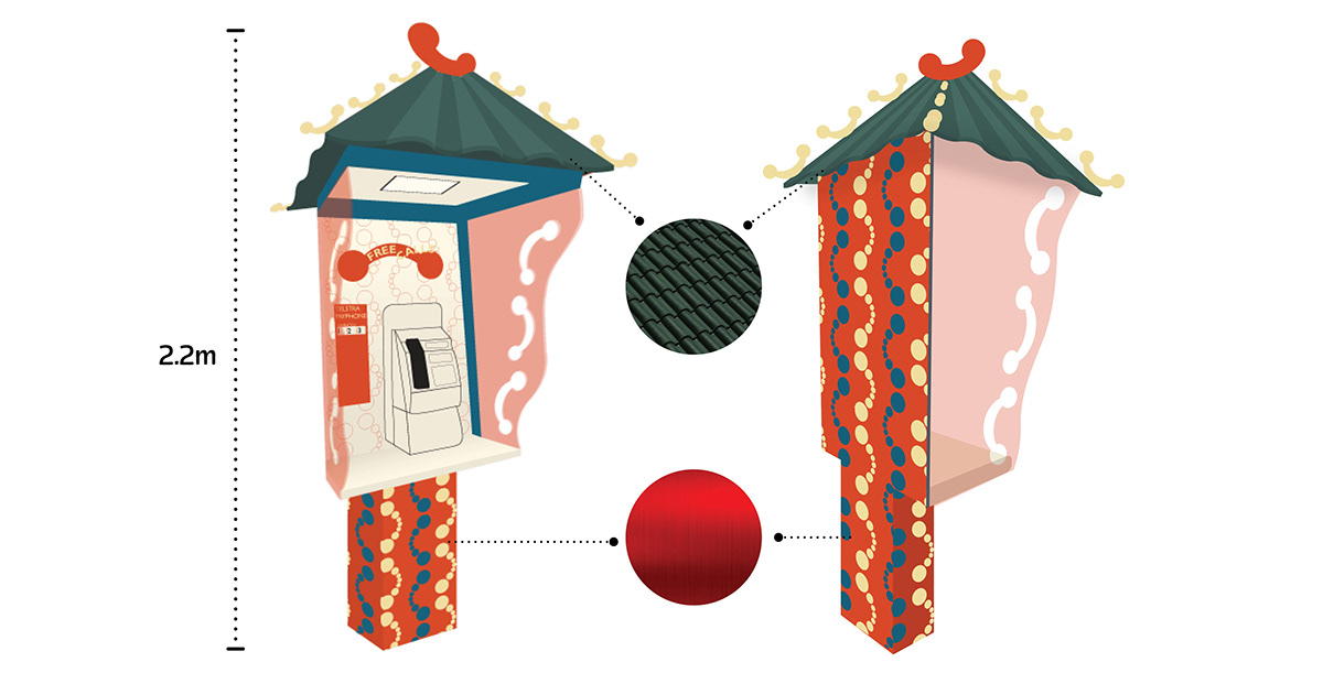
PHONE BOOTH
The appearance is inspired by a small Chinese worship which family members can pray for the safety and health of their family. Graphic elements were added to bring a modern touch.


STAIRCASE
The staircase was designed with the look of a Chinatown gate entrance. Since it is made of wood, I added another pair of feet to the base to make it a solid step. The purpose of this staircase is to allow the viewer to interact with another design - the ‘Hug’ sculpture.


HUG
This is an 'embrace' sculpture, which is designed to wrap around a tree and extend its arms. It is an interactive sculpture that allows the viewer to embrace it.


FINAL IMAGE from 2D to 3D

⇩⇩⇩


